Your homepage is often the first real interaction potential business customers have with your company. Unlike B2C buyers, B2B decision-makers arrive with specific questions: Can you solve my problem? Can I trust you? Is this worth my time and budget? If your homepage doesn’t answer those questions quickly, you could lose valuable leads before you even start the conversation.
Below, we break down the key elements that make a B2B homepage convert visitors into leads, keeping both strategy and user intent at the center of every section.
1. Clarity Starts With a Strong Value Proposition
First impressions matter, and there’s no better place to make your value clear than at the top of your homepage. Your value proposition should immediately answer three core questions:
- What you do
- Who it’s for
- Why it matters
This message should be short, specific, and free of generic corporate buzzwords. Remember, B2B buyers scan fast; they want to know within seconds if your solution fits their needs.
Tips to get it right
- Use simple, benefit-focused language.
- Place the value proposition above the fold, no scrolling required.
- Support it with a brief subheading that addresses a common pain point.
2. Transparent Pricing Information Reduces Friction
Many B2B websites bury or hide pricing. They do this to force prospects into calls or forms before they can even see if you’re in their budget range. This common practice creates unnecessary friction.
By offering transparent pricing or pricing ranges on your homepage, you:
- Help buyers self-qualify
- Build trust through honesty
- Increase the likelihood of qualified demos or contact requests
What to show
- Starting prices or tiers
- Features included at each level
- Explanations of pricing factors (e.g., company size or usage)
3. Tailored Messaging for Distinct Buyer Segments
B2B audiences aren’t monolithic. A manufacturing manager, an IT director, and a procurement officer will each have different goals and vocabulary. Generic messaging makes no one feel seen.
How to personalize effectively
- Identify your core audience segments (by role, industry, or company size)
- Create straightforward navigation or sections for each group
- Use language that reflects their unique challenges
This makes your homepage feel more relevant than generic.
4. Social Proof Through Case Studies and Testimonials
B2B purchases are high-stakes decisions that rarely happen on impulse. Testimonials help, but case studies with numbers and measurable results are even more powerful.
Best practices
- Highlight outcomes (e.g., “Reduced costs by 30%”)
- Use real client names, logos, and specific metrics
- Place proof strategically throughout the homepage
This builds credibility and helps buyers visualize success with your product or service.
5. Multiple Conversion Paths — Not Just a Demo Button
Not every visitor is ready for a demo or sales call immediately. For B2B buyers early in the decision cycle, low-commitment conversion options lower barriers and begin nurturing relationships.
Examples of lower-friction CTAs
- Newsletter signup
- Downloadable industry reports
- Free tools or interactive content
These options keep prospects engaged while they evaluate solutions.
6. A Clear Visual Hierarchy and Clean Layout
Even the best content falls flat if it’s buried under clutter. A clean visual layout with distinct sections helps visitors easily find what they’re looking for.
Design tips
- Use whitespace intentionally
- Break content into digestible chunks
- Limit fonts and color schemes for consistency
A clean layout makes your homepage feel professional and navigable, not overwhelming.
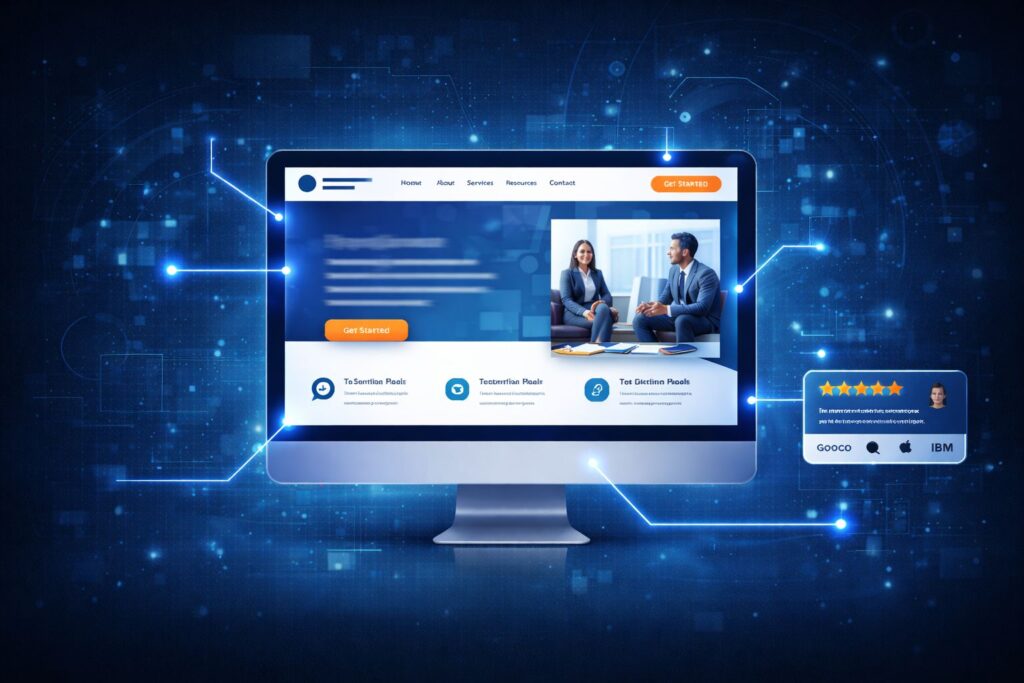
7. Strategic Use of Imagery and Product Demonstrations
Seeing is believing, especially in B2B. Rather than generic stock photos, use real product visuals, diagrams, or brief videos that show your solution in action.
This helps buyers understand:
- What your product actually looks like
- How it works in real scenarios
- Why it’s worth considering
Visuals support messaging and make complex solutions easier to grasp.
8. Strong, Obvious Calls to Action (CTAs)
Every homepage should guide visitors toward a meaningful next step. Your CTAs need to be:
- Prominent
- Contrasting in design
- Action-oriented
Keep options straightforward, for example, “Request a Demo,” “View Pricing,” or “Download Case Study.”
Final Thoughts: Make Decisions Easy
A high-converting B2B homepage isn’t about cramming every detail onto one page. It’s about clarity, relevance, and guided decision-making. By answering key buyer questions quickly and providing strategic pathways forward, you’ll keep prospects engaged longer and nurture more qualified leads.
Start by walking through your own homepage with fresh eyes. Would you know within seconds what you do, who you help, and what to do next? If not, it’s time to optimize.